The Hub
Label Design
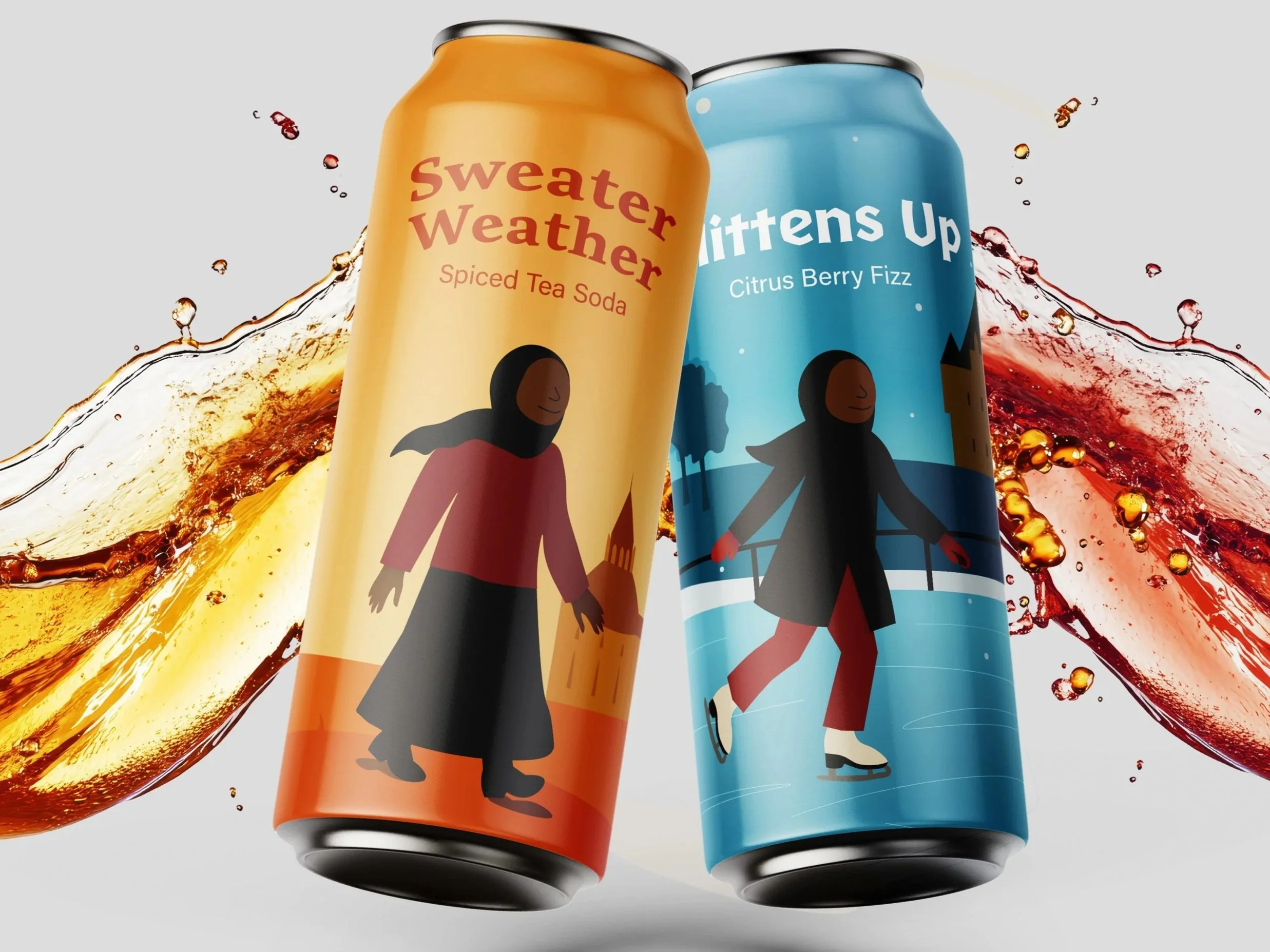
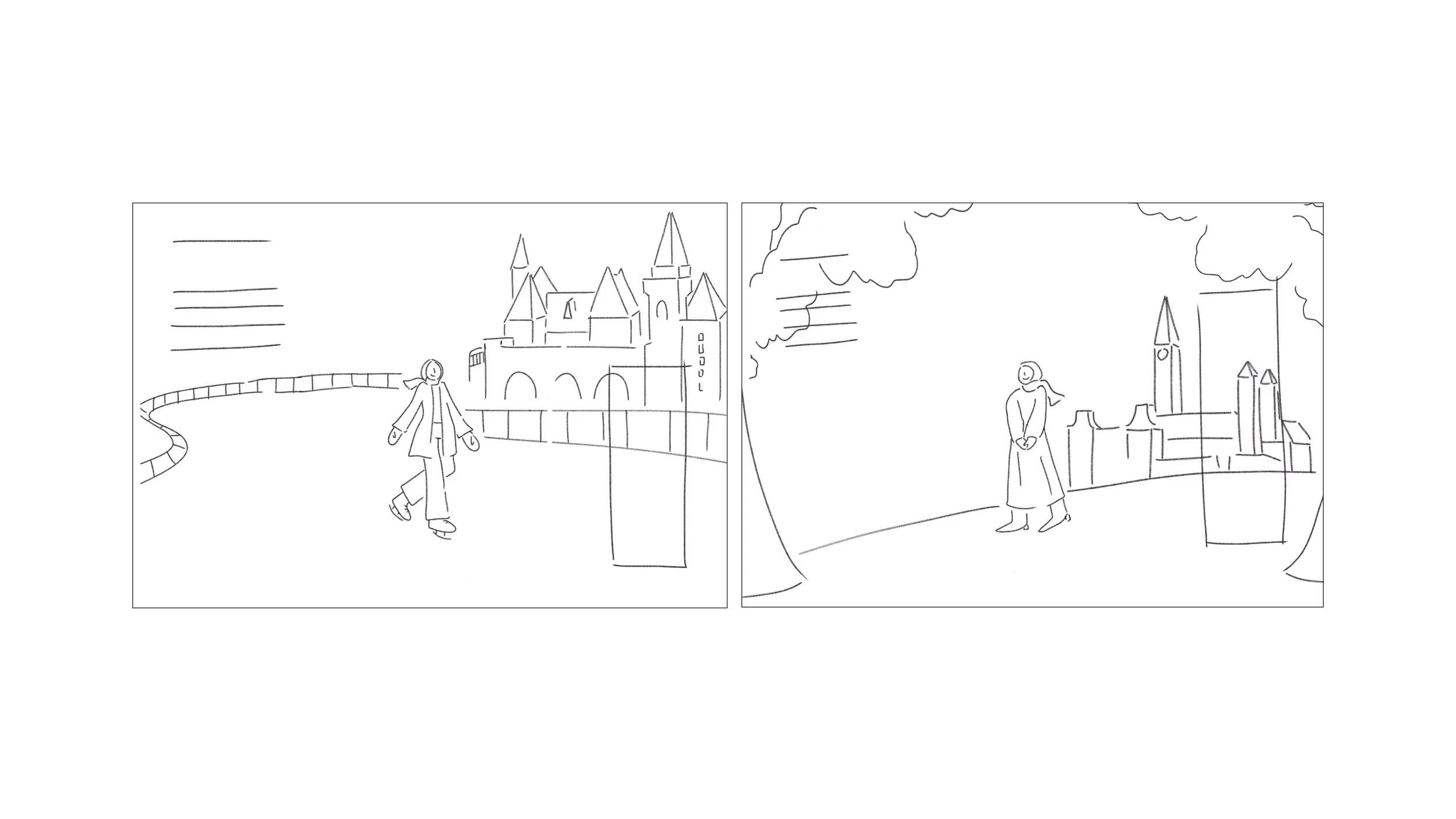
Creating a seasonal beverage brand inspired by Ottawa’s fall and winter
This branding project for The Hub Café introduced a limited soda line celebrating Ottawa’s cozy seasons. The designs capture the warmth of community during the city’s cold months through expressive illustration and inclusive storytelling.
Process
Designing through seasons and storytelling
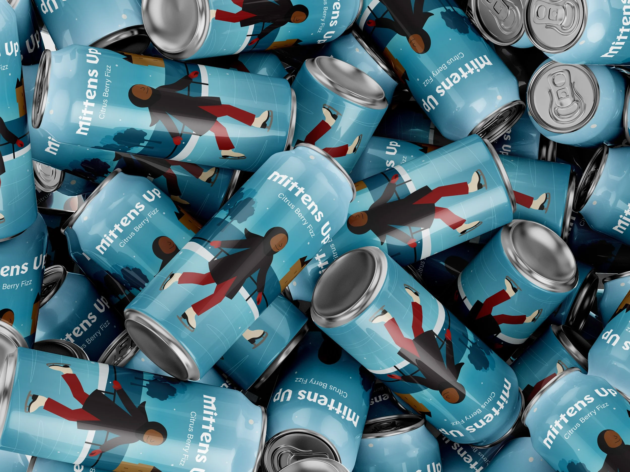
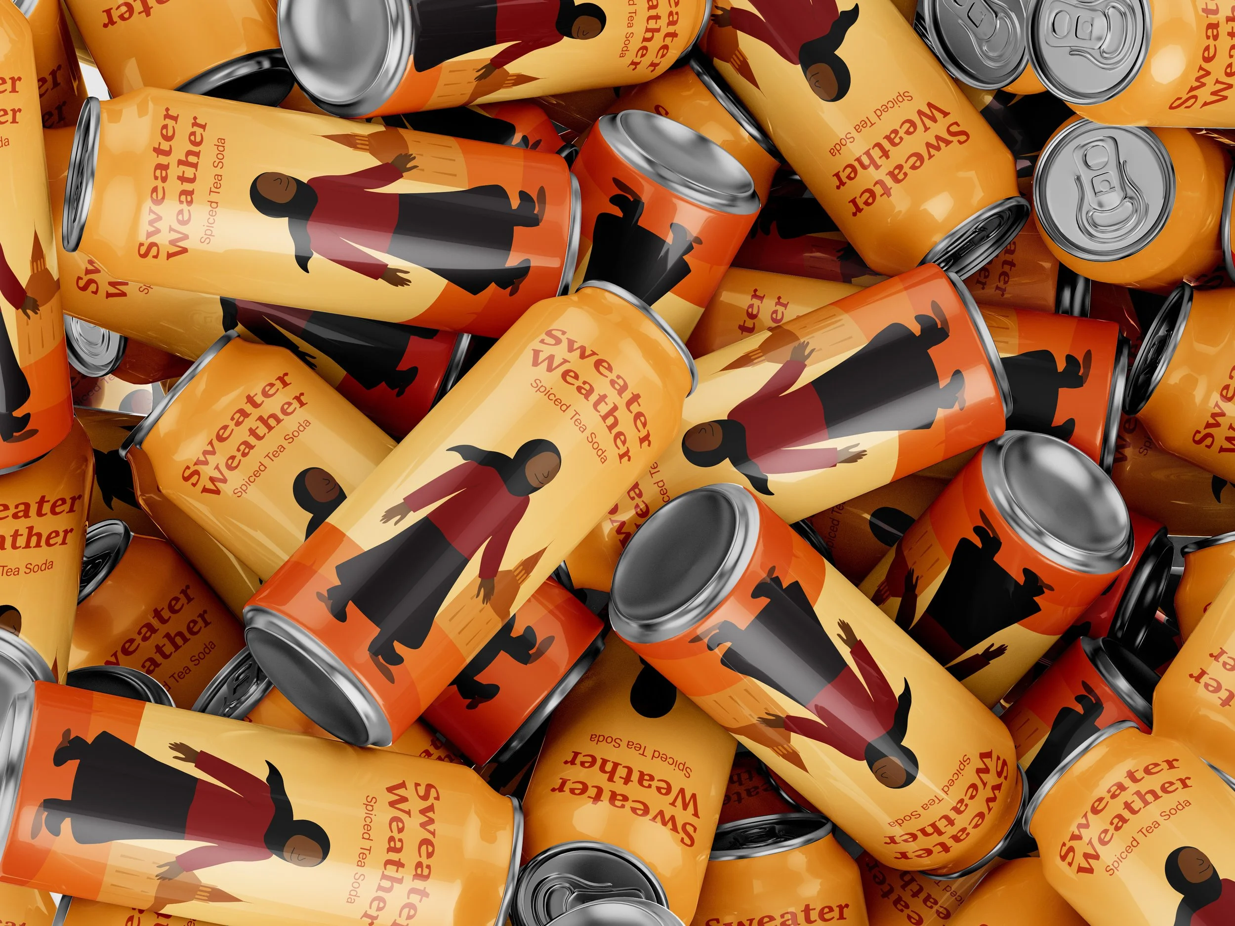
Two flavour designs were created — one for fall and one for winter, each reflecting its seasonal character through colour, texture, and atmosphere. The fall soda used deep ambers and leafy accents, while the winter design introduced icy blues and soft tones. Each label featured a Black Muslim character, representing diversity and belonging within the Ottawa community.
Result
A welcoming and culturally grounded brand identity
The final design features organic type, handcrafted textures, and earthy colours that reflect the café’s community spirit. Across signage, packaging, and merchandise, the brand feels authentic and inviting, a true reflection of The Barn’s story and roots in Palestinian culture.